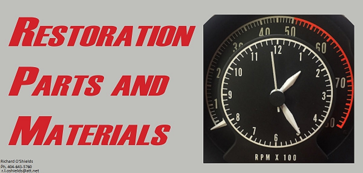
polara71
Old Man with a Hat
The story......
About fifteen years ago I was at the Englishtown NJ swap meet. As I always do I look through the literature for my years, 70 and 71 Dodge polaras/Monacos. I found this neat but unique looking 1970 Dodge Polara brochure but unlike I had ever seen. I asked the seller about the constitution wording on the back and he said he wasnt familiar with it. He then said if I wasnt going to buy it hand it back to him. Well, for ten bucks I put it back, no way I was spending ten bucks. I handed it back to him and he put it under the counter in his sales trailer.
I always wished I had bought that brochure, from the moment I walked away I wished.
Fast forward to last years Hershey event in October and I speak with that same vendor and ask him about the brochure, he said its in his collection and I could have it for $30.00. We agreed I would pick it up at this years ACN at Carlisle.
The seller believes it to be from a collection of a automotive writer/historian that he purchased many years ago. He also believes it to be "pre production" of the final brochure.
Here is what I bought on the lower left.

A close up of the front

Comparing the two paint charts

Close up of the constitution wording which is on the whole back layout

open to the rear spread in comparison

Middle shot

I read this as gibberish but someone may recognize this as a language

Awfully crude ......

Just thought I would share this with you guys, old car literature can be interesting


About fifteen years ago I was at the Englishtown NJ swap meet. As I always do I look through the literature for my years, 70 and 71 Dodge polaras/Monacos. I found this neat but unique looking 1970 Dodge Polara brochure but unlike I had ever seen. I asked the seller about the constitution wording on the back and he said he wasnt familiar with it. He then said if I wasnt going to buy it hand it back to him. Well, for ten bucks I put it back, no way I was spending ten bucks. I handed it back to him and he put it under the counter in his sales trailer.
I always wished I had bought that brochure, from the moment I walked away I wished.
Fast forward to last years Hershey event in October and I speak with that same vendor and ask him about the brochure, he said its in his collection and I could have it for $30.00. We agreed I would pick it up at this years ACN at Carlisle.
The seller believes it to be from a collection of a automotive writer/historian that he purchased many years ago. He also believes it to be "pre production" of the final brochure.
Here is what I bought on the lower left.
A close up of the front
Comparing the two paint charts
Close up of the constitution wording which is on the whole back layout
open to the rear spread in comparison
Middle shot
I read this as gibberish but someone may recognize this as a language
Awfully crude ......
Just thought I would share this with you guys, old car literature can be interesting