Carmine
Old Man with a Hat
I don’t know about you, but I don’t find the styling of new vehicles to be attractive. There are a few I like, but for the most part, I know they’re either compromised because of aerodynamics, packaging or safety regulations.
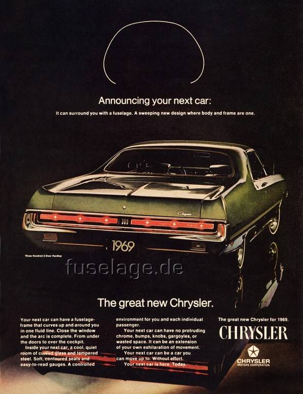
The first shows up in the lack of “tumblehome”, which is basically the signature of fuselage cars. (Narrow roof, wide center section, narrows again at the floor pan).
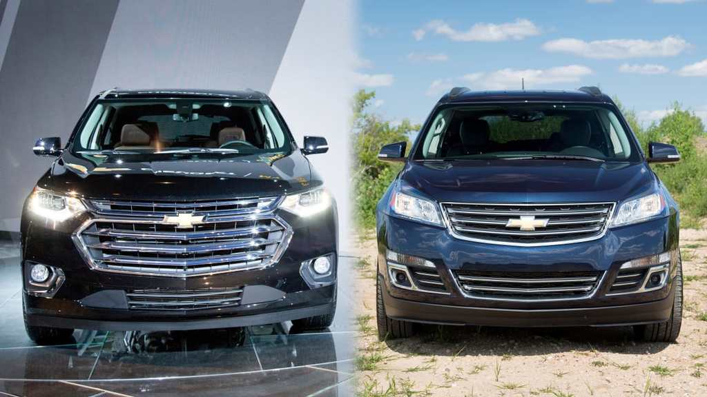
A modern car typically presents a large, blunt “face” to the wind, because (believe it or not) that’s better than a bunch of smaller surfaces like tires, bumper edges, and concave/convex surfaces which disrupt airflow and create drag. What drives this is many faceted, but the first is fuel economy and the need to meet Federal standards. Secondarily it’s reduced wind noise.
Packaging is what explains tall rooflines. Basically for every inch you’re sitting upright; you can reduce an inch of length. No one sits three-abreast (not that many really did in olden days), and everyone wants a console to store their junk. That allows a narrower width, which again decreases drag. The result is shorter-taller-narrower; the exact opposite of longer-lower-wider; a design mantra that lasted from about 1935 to 1975.
Safety regulations as they pertain to pedestrians have more effect on design than passenger safety. This manifests as shorter hoods, taller, blunted and flush front end details. The idea being you “flop and tumble” off the front of a car as opposed to having your hip/legs broken, or submarining under the front wheels.
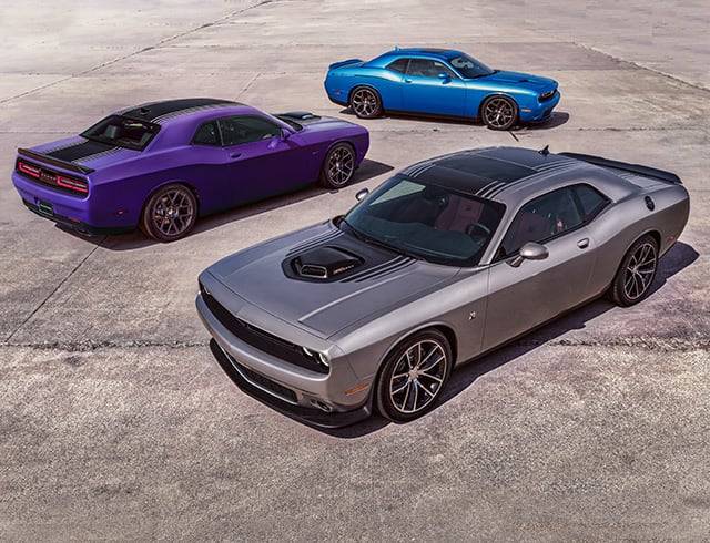
The current Dodge Challenger is the most obvious example of bucking these trends, but it’s an outlier in 2019, not the more/less typical shape as it was in 1970.
I wrote the above as context for explaining the conversation I had yesterday with a citizen while at work within Chrysler. By “citizen”, I mean a person who is employed by Chrysler, but isn’t at all involved with design/testing/production/sales, etc. Sort of like how the mafia looks at guys who aren’t in-the-business. He is one of thousands of support people here that does HVAC, IT or one of dozens of other non-automotive functions. That part doesn’t matter. A bunch of co-workers were talking about the opening sequence of “Get Smart”, to which he interjected “I’ll be you guys didn’t know the car he drove was called a Sunbeam, and was made by the same company who made mixers!”
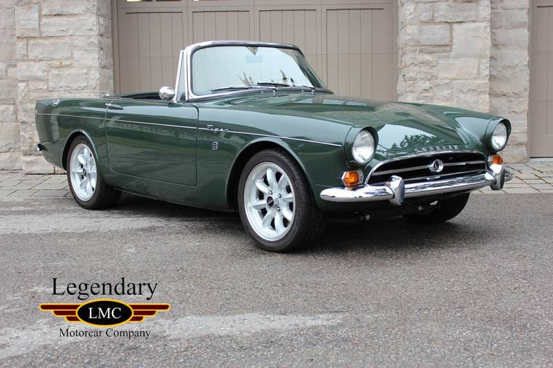
To which I said, “Stop. We’re all car people and now we’re going to laugh at you.” Then, “Rootes group from the UK, Ford V8, etc.” And when I Googled it to show him, a bunch of other 60s cars popped up, to which he said “Yuck. Old cars were so ugly”.
Now that statement stopped me dead in my tracks.
Giving him a chance to recover, I said “You mean all these little English economy pods, right?”
“No, all old cars.”
“You’re ******* nuts.” As I googled a nice, long-low-wide C-body…
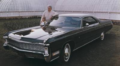
“That’s so obsolete. Nowadays they can do so much more with plastics, LED lights, and special steels, blah, blah…”
To which I said, “The first part of that statement is true. We CAN do a lot more with those materials; BUT no one does. They create aggressive-looking insects with hunched up rear ends that look like a dog laying a deuce.”
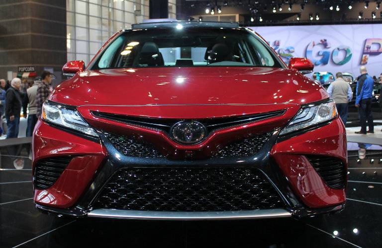
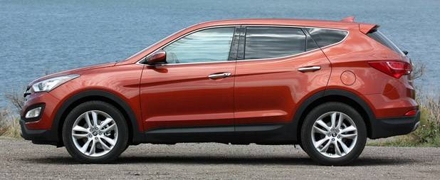

*Now to be fair, I think Chrysler/Jeep/Dodge/Ram is the LEAST guilty of this. The Asian brands are the worst, followed by Ford and GM. Some European cars still look acceptable.
My argument was that regulation was driving the use of these advanced materials, not aesthetics. I contend that I am correct, but realize it means nothing. We debated this a bit more until we agreed a truce would be called and we’d go back to doing something productive. I must tell you that I find 90% of what’s on the roads to be literally dystopian blight. What's wrong with this picture?
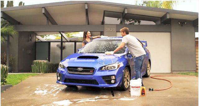
Oh yeah, there's a roach in it.
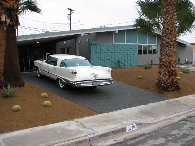
And we needn't limit this to mid-century style. The "Formal/Spanish Castle" era seems 100 years ago as well.
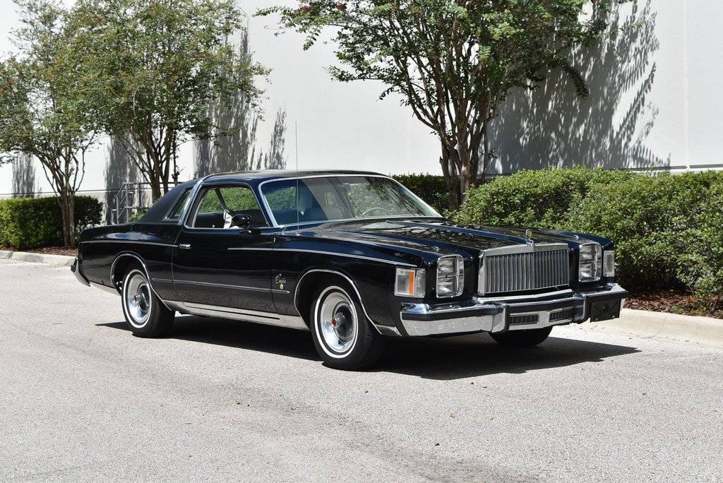
Whereas those rare moments when I see an older car in traffic bring a smile to my face.
Your thoughts?
The first shows up in the lack of “tumblehome”, which is basically the signature of fuselage cars. (Narrow roof, wide center section, narrows again at the floor pan).
A modern car typically presents a large, blunt “face” to the wind, because (believe it or not) that’s better than a bunch of smaller surfaces like tires, bumper edges, and concave/convex surfaces which disrupt airflow and create drag. What drives this is many faceted, but the first is fuel economy and the need to meet Federal standards. Secondarily it’s reduced wind noise.
Packaging is what explains tall rooflines. Basically for every inch you’re sitting upright; you can reduce an inch of length. No one sits three-abreast (not that many really did in olden days), and everyone wants a console to store their junk. That allows a narrower width, which again decreases drag. The result is shorter-taller-narrower; the exact opposite of longer-lower-wider; a design mantra that lasted from about 1935 to 1975.
Safety regulations as they pertain to pedestrians have more effect on design than passenger safety. This manifests as shorter hoods, taller, blunted and flush front end details. The idea being you “flop and tumble” off the front of a car as opposed to having your hip/legs broken, or submarining under the front wheels.
The current Dodge Challenger is the most obvious example of bucking these trends, but it’s an outlier in 2019, not the more/less typical shape as it was in 1970.
I wrote the above as context for explaining the conversation I had yesterday with a citizen while at work within Chrysler. By “citizen”, I mean a person who is employed by Chrysler, but isn’t at all involved with design/testing/production/sales, etc. Sort of like how the mafia looks at guys who aren’t in-the-business. He is one of thousands of support people here that does HVAC, IT or one of dozens of other non-automotive functions. That part doesn’t matter. A bunch of co-workers were talking about the opening sequence of “Get Smart”, to which he interjected “I’ll be you guys didn’t know the car he drove was called a Sunbeam, and was made by the same company who made mixers!”
To which I said, “Stop. We’re all car people and now we’re going to laugh at you.” Then, “Rootes group from the UK, Ford V8, etc.” And when I Googled it to show him, a bunch of other 60s cars popped up, to which he said “Yuck. Old cars were so ugly”.
Now that statement stopped me dead in my tracks.
Giving him a chance to recover, I said “You mean all these little English economy pods, right?”
“No, all old cars.”
“You’re ******* nuts.” As I googled a nice, long-low-wide C-body…
“That’s so obsolete. Nowadays they can do so much more with plastics, LED lights, and special steels, blah, blah…”
To which I said, “The first part of that statement is true. We CAN do a lot more with those materials; BUT no one does. They create aggressive-looking insects with hunched up rear ends that look like a dog laying a deuce.”
*Now to be fair, I think Chrysler/Jeep/Dodge/Ram is the LEAST guilty of this. The Asian brands are the worst, followed by Ford and GM. Some European cars still look acceptable.
My argument was that regulation was driving the use of these advanced materials, not aesthetics. I contend that I am correct, but realize it means nothing. We debated this a bit more until we agreed a truce would be called and we’d go back to doing something productive. I must tell you that I find 90% of what’s on the roads to be literally dystopian blight. What's wrong with this picture?
Oh yeah, there's a roach in it.
And we needn't limit this to mid-century style. The "Formal/Spanish Castle" era seems 100 years ago as well.
Whereas those rare moments when I see an older car in traffic bring a smile to my face.
Your thoughts?


